Visual Poetics
Thought · Diction · Song · Spectcale · Catharsis

This series humbly looks up to Aristotle, asking him how his principles of storytelling (plot, character, thought, diction, song and spectacle) can be applied to and potentially enhance data visualisation. So far, we’ve covered plot and character. In this post we’re visiting the rest of his principles before summarising our deliberations.
Next is thought. Aristotle is a little coy or rather mystic about it but let’s assume he means what the world thinks he means: 'theme'. Vengeance in Troy, love in Romeo and Juliet, philanthropy in Ice Age. The theme taps into the 3 before mentioned sub-principles of unity, magnitude and universality. A theme consistently pursued creates a meta-unity of story — a theme being expressed by a variety of plot-events and mirrored by characters adds magnitude. As such a theme can raise the play to a higher order of message, in the sense that ‘the story is more valuable than the sum of its plot-events’. Why is that? Because a story is an interaction between the plot and the audience. The audience enriches the plot with their very own world-knowledge and context, tickled out by the theme.
Theme applies to both story and context. Theme is the nucleus of a play, a film, a book and a data visualisation. It holds it together and should be visited often times when producing any of the above. It provides conceptual unity, a backbone to the piece. A strong theme allows more freedom in plot-construction as it can hold together distant parts of the plot. As such it’s a tool for the producer. Yet while producers have more or less natural copyright on the plot or the manifestation of their text, they have to share the theme with the reader. Although the actual information displayed in the visual might be new, the theme discussed will most likely not be. Views, knowledge, beliefs will already be in place and will very much mingle with the thematic interpretation of the text.
The theme of our NY Times visualisation is control. Three forces in the form of the incumbent OPEC, the challenger US as well as the more elusive force of political events with global impact determine two metrics: oil price and oil production. The New York Times decided to explain this visually with a connected scatterplot. One could have shown it differently. But whatever way we show it the theme would remain. Fictional media often plays with the theme. It’s not overtly revealed and serves as an elusive thread through the text that gets pieced together slowly by the reader. For informative visualisations, it may help to clarify the theme openly in order to activate the reader's contexts up front. For the design process of a complex visual — explanatory but also exploratory — a constant awareness of the theme supports design- and thematic coherence.
Diction
Diction – Aristotle’s fourth principle of storytelling – is an interesting one from our perspective. It’s basically 'style'. The style of the words to be more precise. He warns about the usage of metaphors and ‘rare’ words. Overusing metaphors can keel over to a riddle and unusual word-use to crypto-jargon no one follows voluntarily.
You don’t need to leaf through many pages of any standard data visualisation work to get warned about bells and whistles. Discipline in the use of data-ink is mandatory (even in the screen-age) and the purposeful focus on the necessary shall lead to a streamlined and non-distracting design.
Little Diction:

More Diction:

Little Diction:

More Diction:

What I did here was to take away the all-to-eager decoration of the information in order to establish a clear understanding of the information. Maybe I was a little too purist - one could use pictograms to show the costume categories or flags and a more 'cosmetic colour-setting' in the second example. Yet, the visual diction should not obstruct or even falsify the information.
Hang on though. We just established that metaphors are welcome as they can arouse engagement which — if not used — could lead to a smaller readership or lesser impact of our visual. Now we are told to speak clearly and directly avoiding exactly the metaphors we were hailing above. And it’s true — the line is fine. A simple visualisation which does not need to bootstrap significant amounts of engagement, but can be read fleetingly, should be as concise and focussed as possible. A more complex visualisation, which requires time to decipher, can use allegorical design to draw in the reader. An additional level of interactivity like in the OECD Better life index can produce non-metaphoric interpretations of the same pattern if possible.
Get the gist with organic design:

Get precision with efficient design:

Song
Aristotle’s number 5 is Song or Melody and accompanies Diction in the sense that it is a stylistic engraving — even more so than Diction. While Diction — or the style of the words used — can be a valid, even essential actor of the play and plot, song is more of an embellishment, an engraving, an ambient tapestry — necessary but imaginable in various forms without doing too much harm; a hygiene factor of sorts, as it would hurt if not used but remains in the background when used. However, Aristotle demands the song to be more than that. It should not only be mere background, it should be an active agent in the play claiming a role and driving the plot.
For Greek plays of Aristotle’s time we have to imagine a background choir accompanying the proceedings with an appropriate tonality. The aim was to subtly reinforce but not drown out the dramatic events on stage. In data visualisation it is the stylistic setting that represents this tonality. This includes all design elements that build the background for the data-shapes like colour schemes, containers, fonts, weights, etc.
For a statistical graph in an academic paper, tonality should be neutral. A colour scheme of white, grey and a few hand picked functional colours with a clean serif font; headlines set apart from annotations via font-size and -weight. For more journalistic or narrative pieces a different tonality can be set. Periscopic’s Gun Death visualisation probably purposefully chose a black background with slow transitions for title and controls to support the topical gravitas. Kiln’s interactive Carbon Emissions Past, Present and Future also finds a specific tonality in a simplified near cartoon-like background signalling simple explanations in a topical setting.
Periscopic · Gun Deaths:

Kiln · Carbon Emissions:

Spectacle
These days probably called special effects, Spectacle is not apportioned to the poet. Aristotle recognises it as the job of the ‘stage machinist’ (good title) to support the plot with spectacle in order to generate emotions. External and surprising, underlining and loud, the spectacle, the ‘stylistic effects’ are supposed to help emotions to bloom. He acknowledges the spectacle as a means to an end, which, however, should rather be reached by plot and character. The main reason for his scepticism is that spectacle is a blunt tool. It shocks rather than subtly moving under the skin. As it is external by definition – neither naturally evolving from plot or character nor remaining in the background like 'Song' – it finds it hard to dock onto the viewers’ inner self, to reach empathy and trigger engagement.
Again, Aristotle underlines the focus on the essence shining through in most of his principles, most evident in his deliberations about Diction. Where’s the difference? Diction is concerned with the very fabric of the play, the spoken word. In data visualisation this fabric is produced by the shapes and their styles – form, colour, weight, orientation. Spectacle is external to text. The text can live as such — the spectacle can't. Spectacle has supporting character. A visualisation can live without an initial animation. A transition is often very much part of the text in serving object constancy. This would indeed be a decision of visual diction. However, an initial animation into space, or a transition from one graph into another, popping network-nodes before moving on to an alternative display is spectacle. In visualisation these strictly superfluous effects don’t necessarily propel the cause of the display, yet they can turn the display into a fluid one, a round corpus or text, improving the experience of the reader. As such they are invited as long as they remain in the background, understanding their supportive role and not burning any valuable time.
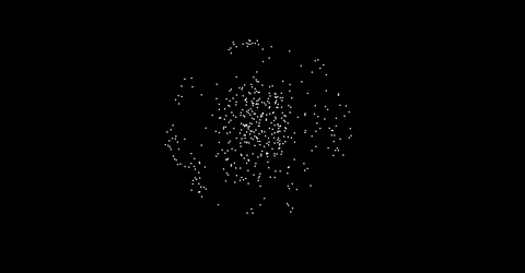
Bad spectacle:

See the arcs and ‘explosions’? Good spectacle:
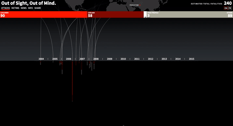
Out of Sight, Out of Mind by Pitch Interactive
We have now reached the end of our principle trip and shall eventually tie it up with what Aristotle would call the aim of every tragic story…
Catharsis
In fact, Aristotle doesn’t define Catharsis in his works, yet he uses it enough to let us derive a definition. There are two main definitions: the literal one — closest to his examples — describes the healing effect a tragedy has by chucking us into the deep end of our emotions, re-surfacing purified, purged and renewed and with a better understanding of emotions such as pity and fear. The lateral one — established in the 20th century — speaks of an intellectual clarification. The audience partakes in a representation of reality and the mixture of distance and proximity creates a space of intellectual pleasure and inference. We reach higher levels of understanding through reality simulations. It’s how children learn through games. In both cases, catharsis operates on the meta-level of the text. It is the process of learning from a play.
This is the purpose of a text – the purpose of communication. Aristotle’s ideal play wants to educate, to make the viewer understand and learn, change perspectives, ideas, opinions or beliefs. We should equally judge the text ultimately by how well it achieves a change of mind. In the case of Aristotle’s plays catharsis first purges us of existing emotions in order to re-assemble them in a part-conscious way. In data visualisation we rarely want to change emotions, but always knowledge. We also don’t necessarily need to tear down existing knowledge, yet often aim at building new knowledge. Stephen Few summarises: “we should always judge a visualisation's merits by the degree to which we can easily, efficiently, accurately, and meaningfully perceive the story that the information has to tell." For want of a better word, data visualisation should be not cathartic, but refining.
By creating a fabric of data-driven meaning, creating structures of narratives where applicable, designed for unclogged visual consumption, focussing style and content on engaging essentials, we aim to build a new or at least modified and hopefully lasting perspective.
To put it simply: we design visual data displays that read clearly, engage continuously and refine perspectives sustainably.
Well, then. We have visited all of Aristotle's principles of storytelling from Plot to Character to Thought, Diction, Song and Spectacle and arrived at Catharsis, the audience-changing aim of a story. In the final post I shall try to summarise them to a more comfortable tool-belt we can easily don when building visual displays. A kind of Aristotelian cheat-sheet...