Visual Poetics
Plot


This series humbly looks up to Aristotle asking him how his principles of storytelling (plot, character, thought, diction, song and spectacle) can be applied to, and potentially enhance, data visualisation. After a brief introduction in the last post let's put some feathers on the bird by looking at Aristotle's first principle: Plot.
 ..and we shall do this modestly. Cap-in-hand..
I shall define each principle in the Aristotelian sense first, before most respectfully introducing it into a visualisation context, considering a visual meaning and function and lastly applying it to a visual example. I will use a number of visuals to illustrate my reflections but will revisit the New York Times’ How the U.S. and OPEC Drive Oil Prices by Jeremy Ashkenas, Alicia Parlapano and Hannah Fairfield repeatedly in case you want to have a look...
There will be a total seven stops along the way: Plot, Character, Thought, Diction, Song and Spectacle as well as the aim of each story: Catharsis.
Plot
Plot the first and most important principle describes the arrangement of the story’s building blocks. It’s the structure, the narrative, the sequencing of a story. What comes first, what then, what last. Freytag’s Triangle pours this into a simple, if idealistic shape:
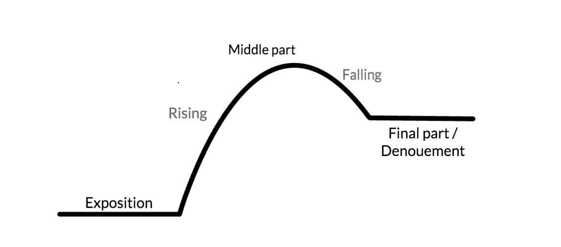 (Freytag’s bump this is rather)
It’s a beginning – a middle – an end. Nursery rocket science. The way each part is connected to the chain of events is important: The exposition has to stand on its own legs. What happened before is downplayed; the focus is on the events to come. The middle part is infused by the beginning and propels towards the end. The end looks back rather than forward. It wants closure.
The concept of a plot promotes one crucial story characteristic that’s truly useful for our mission: it offers a backbone structure to which we can attach meaning relatively easily. Each story acts as a little memory-chain, sensibly connecting pieces of information that are harder to remember on their own. The story is greater than the sum of its parts. How does it do this efficiently? Through drive, unity and magnitude...
Plot-drive
The plot is driven either by cause and effect or by a character and their personality. Aristotle is quite a frank supporter of the former: the cause and effect. This is owed to the plays of his time that rather centred on a topic than a character. Times have changed a little in literature and drama but let’s note that the sequence of events as well as characters within this trajectory drive a plot forward.
There are 2 levels of cause-and-effect-(like) drive in visualisations: on the visual micro-level and on the conceptual macro-level. The former is literally inscribed into the very definition of visualisation:
Visualisation is driven by patterns. That’s what a visualisation technically is – it’s a sensible arrangement of data patterns encoding information in graphical marks and perception channels. There are numerous patterns to represent like time-series, clusters, comparisons, networks, etc. but all patterns relate at least two pieces of information to each other. While true causality between the data is rare, a dependency not acted out conceptually but tangibly drawn on the canvas can invoke a very strong adhesive between different regions of information.
Chart types predestined for plot-like developments are line charts, flow diagrams or connected scatterplots that convincingly invite the viewer to follow an often linear trajectory with data-points on the way linking data in a propelling form.
On the conceptual macro-level we can come quite close to Aristotle’s ideal, considering ‘the stepper’, a narrative technique used in more presentational data visualisations. An extension or variation of the stepper is ‘the scroller’ which has the same effect, namely moving from one display to the next display controlled by the reader (some might say ‘scrollytelling’). The stepper itself doesn’t unfold any cause and effect, but it forms the structure with which to do so.
The New York Times’ visual How the U.S. and OPEC Drive Oil Prices combines both levels of cause-and-effect-drive by displaying a connected scatter-plot within a stepper-setting.
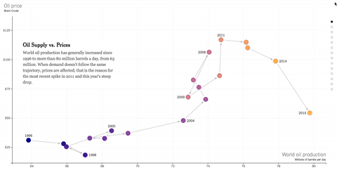
The context of the visual piece is control of the oil price development over time; the story is the rise of the US to a global oil power exploiting shale oil. While the connected scatterplot literally drives the development through time, spanning an arc of increasing and then falling prices, the stepper drives the development of characters: mainly the OPEC countries and the US. As this story is split in 2 levels of narrative, the temporal level through the connected scatterplot as well as the character level through the stepper, there are also 2 parallel plot-lines: the development of the metrics’ oil-price and oil-production and the events and characters influencing the metrics. Cause and effect.
Moving back and squinting our eyes we can further uncover a 3-parted plot-structure with an exposition, a middle part and a conclusion. The plot’s exposition stretches from step 1 to step 3 inclusive. It covers the general arc of the connected scatter showing a global overview from 1996 to the spike in 2011, then zooming in to individual patterns, one after the other. Starting with the rule of the OPEC step 4 introduces what one could nearly call a plotpoint and transitions into a middle part of rising action starting at step 6. We leave the overview and re-start the journey in April 1996. During steps 8 to 11 we are part of literally rising action as events like China’s emergence and the Iraq War boost prices and the financial crisis reduces prices. At step 12 of 14 we enter the final part, now focussing on the key topic: the US impact on the oil price. The final step 14 allows an outlook for a changed future in the annotation while the visual focuses on the current status against the opaque data backdrop of the past 20 years.
Plot-unity
The second key requirement for an Aristotelian plot is plot-unity. The atomic pieces of the plot should be kept in a sequence. They are supposed to relate to each other, to lead to each other, drive each other, be in some sort of chain. The Aristotelic ideal stresses the importance of a single plot (unity of action), a single location (unity of place) and a single day (unity of time). The opposite of a united plot would be an episodic plot. Magnolia, Night on Earth and (in parts) the Illiad – all episodic.
Plot-unity aims at a coherent, dense and undistracted experience for the audience. The audience shouldn’t spend time puzzling together the individual pieces, but should be immersed in the story (context) for the message to unfold effortlessly. There are of course clever alternatives in theatre, literature and film. Memento unfolds the story through exactly the opposite, plot-disunity. A data visualisation can try to be Memento. Often, however, it makes sense to help the reader’s understanding by presenting the story or the context in a unified manner.
Let's try and abstract Aristotle's unities to data visualisation. But let me be clear: right at the start he confronts us with the most difficult principle to abstract and the most (rightfully) contested principle to apply to data visualisation. The graphical layout of information often is not and should not be linear. 2 important side-notes:
- While the information encoding is often not linear, the decoding on the recipient's side often is. We look at a mess and we strive for clarity and patterns, plot-like creatures that might follow the same principles as Aritotle's plots. Take for example what we make of an anti-linear plot like Memento's — we actively re-arrange it into a linear plot.
- Even in displays presenting worlds (and I'm totally with Moritz Stefaner on this), I'd argue it is helpful for the producer to have an eye for micro-plots, often the building blocks of a larger exploratory display.
Yet, the plot can't be a rule. It of course can be the main structure of a visual (as we see with the NY Times piece), but often it is the road to discovery, or it exists as micro-units, or it just unfolds on the user's side as a means of bringing order to an open field of information.
Hence, shamelessly adjusting Aristotle’s principles, I’d like to formulate a suitably broad definition which should incorporate a unity of content, a unity of form and a unity of time whenever applicable (!). All unities try to focus and convey the message for simple reception. Unity of content conditions the accompanying report to be coherent. This can be achieved by a linear, sequential plot as described previously and manifests itself in headlines, annotations, sub-texts, voice-overs, tooltips etc. Unity of form defines the design of the visualisation, the shapes, marks, channels, colours and setting. We shall return to this later. The unity of content is significantly broader but contextually similar to Aristotle’s unity of action, while the unity of form resembles his unity of place. While unity of content and form are prerequisites for any visualisation, unity of time should be adhered to whenever time is a factor. The Aristotelian definition of a day is obviously very much leaning towards Antique Tragedy, but thought is required to build a coherent temporal space even outside Antique Tragedy. For a time-series this of course is best achieved by a sequence with the starting point before the end point.
The New York Times’ oil price piece establishes all three sub-principles through a number of means. Unity of content is achieved by two story-lines. First, the overview introducing the main characters and the thematic context. Second, the detailed sub-patterns in a sequential time-line ending at the current state of affairs with the US having become an established oil-power. Unity of form is established through coherent use of the design elements guiding perception along the analysis. The New York Times uses scrollable transitions from note to note, arrows for the connected scatter-plots, labels as well as colouring for the years as well as element- and axis-transitioning between states to secure object-constancy. Time unity is secondary in the NY Times visual as the story is told twice but maintained in both time-lines, once top-line as the overview, once low-level concerned with the individual events.
The means of establishing unity are key in data visualisation. Opening up the playing field beyond plots, a unified design should not only be at play in explanatory, presentational visualisations, but also in exploratory visuals that enable discoveries. Project UKKO from Moritz Stefaner is by no means a linear data visualisation telling a canonical story about wind predictions for the upcoming months. It is exploratory.
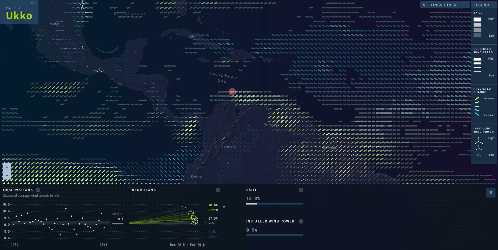
It creates a context in which the user can lookup information or discover patterns. Bringing enough personal knowledge to the table (alas, I’m no wind-expert) I would potentially wrap the patterns in story-like units. However, in any case the interplay of angle, thickness and colour create a visual unity of the map elements; the interplay of colour, transitions and lines to the predictions allow a unity of the additional information display at the bottom of the page. This design supports pattern discovery which act as micro-plots to facilitate story abstraction on the user’s side.
Plot-magnitude
Finally, there is magnitude. Aristotle demands certain magnitude from the plot – in length and complexity as well as in universal significance. A plot will gain value, the richer in meaning it becomes. The more the author manages to introduce a certain level of complexity in an organic unity, the more universally significant the play and the more involved the audience will be.
The holy grail of data visualisation is elegantly to represent the right number of relevant variables. We can visualise a single number, and we can visualise a hairball. But the gods smile upon us when we manage to represent a complex context or story in a succinct way. An obvious example of excellence in this field is Charles Minard’s map of the Russian campaign, where he masterfully manages to marry 6 variables with the reader’s knowledge to conjure up a plot of great complexity, magnitude and universal significance.
Minard's map showing geo-position, troop size, direction, distance, time and temperature:
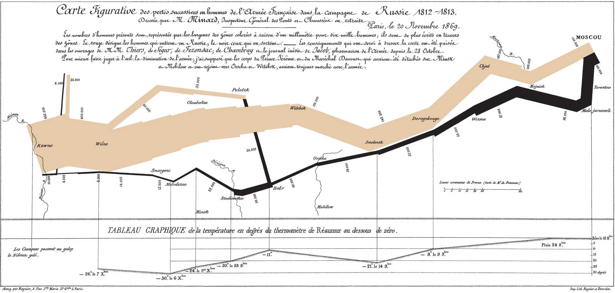
Minard’s map is a fantastic example of how visualisations can unfold stories through a very distinct, unified plot of magnitude. The line our eyes follow embodies a clearly linear, unified plot adorned with plotpoints at crucial moments along the way. The varying thickness tells the most important story, leading the eye from the Niemen river to Moscow and back, through a monumentally humbling experience triggered by visual variables. How much story we produce with context we bring to the plot varies depending on where we come from, how much of ‘War and Peace’ we’ve read and how keen a historian we are.
Right. Thanks for still being here. That took a moment, but 'plot' needed some ink as it is probably the most central principle in Aristotle's rule-book. While we certainly can't carbon-copy Aristotle's thoughts for our ideas concerned with visualisation, plot can be a framework to work with on a micro-level of our designs and charts as well as on a macro-level when conceptually conceiving of a visual data representation. Plot-drive, Plot-unity and Plot-magnitude can function as background-concepts we can decide to apply to varying degrees.
We'll move a little quicker now with the next post about character also taking a single (yet shorter) post, before we’ll look at the remaining principles in one post altogether...