Film Money


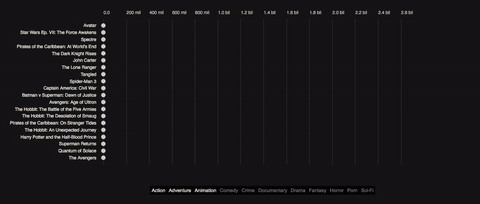
Film money is a visual story about film successes and failures. It looks at a number of Top 20 lists from the Top 20 Biggest Budgets to the Top 20 Biggest Money Losers and guides the reader through the film’s history of spending and earning money as well as gaining and not gaining approval.
Back in 2012 there has been a spree of visuals and interactives about the relationship of film budgets, revenues and ratings when Information is beautiful invited visualizers from around the planet to descend on a dataset called ‘Hollywood Stories’ showing film budgets, revenues, profits, ratings and some more metadata. Some marvelous stuff has been created (see a list of visuals below), but it’s been a while and I thought the topic needs a data story. So here’s my tuppence using a slightly different dataset comprising a wider selection of films and a different angle, focusing on one particular story: the monetary evolution from the production budget via the US revenues to the worldwide revenues and the film’s ratings. Some background to the data, the visual and the technical motivation...
The Data
The budget and revenue figures come from The Numbers. The IMDb ratings come from IMDb and the Rotten Tomatoes ratings from Rotten Tomatoes (magic). Some individual pieces of information were fished out from Wikipedia, but especially The Number’s datasets were already in good, coherent and complete shape so that nearly no enriching was necessary.
Maybe a few points to the Number’s dataset: I got the data on the 10th of October 2017, no films after this date have been included. Further, and this is key, the data is inflation adjusted. So Avatar was made in 2009 for $425 million. In 2017 dollars this is just over $483 million. The adjustment is applied to all films, is exact to the month of the release and adjusts all monetary figures to August 2017. The calculation is based on the CPI, the Consumer Price Index indicating price changes of a basket of consumer goods over time. The data comes from here and if you ever feel inclined you can read a little more about how to adjust for inflation here. You can also have a look at the pretty different story of the unadjusted data here.
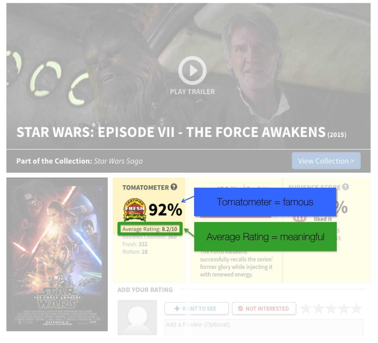
Regarding the ratings, the IMDb rating is taken straight from IMDb and it is their normal rating. Every registered IMDb user can vote, however, the rating doesn’t show the raw mean, but a trimmed and weighted mean. Although the exact methods aren’t published this shouldn’t concern but rather delight as it counteracts rigging attempts.
The Rotten Tomato rating used is not the more famous Tomatometer but the Average rating. The Tomatometer metric is a percentage between 0 and 100%. To calculate the percentage value for a film, each critic is asked to vote a film up (fresh) or down (rotten). The number of fresh films is then divided by all votes to get a simple percentage form 0-100%. The average rating, however, is asking all critics to rate each film on a scale from 1 to 10. I took the latter as it’s a deeper metric summarizing a wider distribution.
If you feel inclined there’s more on this here and here
The visual motivation
Scrollytelling and Lollipos
Telling a story with data is anything but new. The 18th and mainly the 19th century has seen the start of this with many great examples of how to use data and their visuals to tell impactful stories. William Playfair, Florence Nightingale and Charles Minard were fantastic data storytellers. But it required the visual being exceptional in including a visual narrative (like Minard’s map of Napoleon’s Russia campaign) or an exceptional narrator who could in fact tell the story to the right people to have an impact (Nightingale).
Jumping past a few generations, the advent of web technologies and increased processing powers allowed the scripting of animated charts alongside text unfolding a story on the textual as well as the data-visual level. The majority of data stories are currently being told in a marginal tool called Power Point which allows you to put charts and words together and even has some capabilities of animating charts to follow or accompany the flow of the narrative.
However, the benefit of a data story as a web application is that we have many many more tools at hands to create a convincing merger of data, narrative and visual. We can guide readers through a story in a way they’re used to – by reading it themselves – add data to it through visuals which we don’t only juxtapose (Power Point) but interweave with the story. The reader’s experience improves and, if well told, the reader will engage more, memorize more and the narrated dataset has more chance to improve or change the reader’s understanding of the world.
A necessary sidenote should point out that in the past years the term data storytelling has been used often and misused in parts. While one should be aware that most data stories are without a doubt a different animal than aristotelic stories many structural elements are similar and - alas - I can't think of a better term. Onwards...
Until a few years back the key technique for data storytelling on the web was the Stepper (NY Times Budget Proposal 2013, Pathways using not just a simple button stepper but reveal.js, an HTML/JS presentation library that is worthwile using instead of button steppers) and in most case I would argue it’s the best way for a data story that has a few, clear – well – steps to walk through. It segments the story along clear lines and allows the reader to conceptualize these steps, and iterate through them with ease.
Another option is the Play button, which is often used to tell a purely visual story (Jerome Cukier’s Murder visual or - in all modesty - bubble graphs from a dashboard design I did some time back). During the unfolding of a “played” story, authoring happens only on the visual level, hardly or not at all on the textual level. As such it can be impactful as the visual has all the attention, but it is limited in depth as textual narrative can offer a much richer and multi-leveled experience.
And then there’s data scrolling or scrollytelling. Scrollytelling (not sure I like that term either...) links text and data through scrolling. Technically this means the reader scrolls through text and at certain points triggers the data and hence the visual to change. From a user experience point of view this means the reader does what the reader usually does on the web when reading a story: scrolling. And while the reader scrolls the data narrative unfolds alongside the textual narrative. As such it is an organic way to unfold a story online. Yet, I have always been skeptical towards scrollytelling. First of all, the UI and the temptations that come with it can be a little flimsy. It’s very easy – and tempting – for the reader to fast forward unable to find a way back to the point they got carried away from. Further, scrolling gets another task. We’re very used to scroll to show new content. But only in a single dimension. We scroll to move text forward, we scroll to move a map, we scroll to move an element out of the way. But with scrollytelling we scroll to move text and change other – often complex - elements on the page. So it adapts to the readers’ natural understanding of unfolding a story but adds some additional overload.
However, there are clear cases for scrollytelling. One use-case is simply when the data story is recounted as a textual narrative, with individual story segments (sentences, paragraphs) connected in a flow. Steppers are fine in this context, but scrolling puts the textual story more in focus. Additionally, one shortfall of steppers is they only work up to a certain number of steps. The maximum number depends on the story, the dataset and the audience, but my heart would feel a little heavy whenever I encounter 31 buttons to click (sometimes 5 is already too many and in a newspaper context maybe even 3 as Archie Tse from the New York Times reports). Scrollytelling allows for more steps as the steps are hidden and should be made forgotten when the reader is reading the story. There’s of course the size of the scroll bar indicating a story’s length, but having both the scroll-bar and 31 steps would be too intimidating for the average readers.
Also taking some advice from the Olymp of data journalism:

Malofiej 2016, Archie Tse, New York Times, Why we are doing fewer interactives
So there. Those are my bipolar thoughts to scrollytelling. Looking at the chart alone, I’m pretty unipolar though:
I like lollipops.
They are a variation of the bar chart which utilizes two of the strongest channels to encode data: position on a common scale for the circles, length on a common scale for the lines.
In comparison to the common bar chart they elegantly focus the eye on the important piece of the element: the position of the very end or top of the bar indicating the value of the encoded variable. The line – kept lean and pure – does not more or less than what it’s supposed to do: supporting the position measure of the more important circle along the chosen axis.
Now to add to this, lollipops are a natural choice for this particular visual story. What we’re doing here is telling a story of growth and decline (the revenues) from a certain baseline (the production budget). The lines allow us to emphasize animated growth and loss in a brain-friendly way. We can literally follow the path the money takes. The circles are the focus when the visual is static – the lines are the focus when the visual is animated. Lastly, we can easily keep the baseline in view. The baseline circles (the film’s production budget) just lose their lines and can be kept in the visual without disrupting the rest of the visual.
The technical motivation
D3 version 4, Reusable chart pattern and Scrollytelling
The visual is no technical firework. Lollipop charts are rather predictable concoctions of visual primitives (lines and circles). But there were some technical challenges (at least for me) on mainly three other levels:
- D3 version 4,
- the reusable chart pattern for a whole chart rather than only chart-parts,
- and connecting text and events withit a scrolling library.
Two further challenges were to work out firstly how to integrate text elements and event triggers (like data change, chart update and the like) into the storyboard and secondly how to integrate interactivity.
With regards to D3 V4 I was surprised how little broke when I moved the app from V3.5 to V4. By now (October 2017) it sounds almost antiquated to talk about V4 as a challenge, but I built version 1 in 2016 in D3 V3.5. Anyway. Back then I plugged in V4 and reloaded to watch it fail. It wasn’t too bad. Some namespaces needed to be changed to the new camel-case syntax and some selection mechanics needed to be updated. I thought. But it didn’t take long and I realized that I had to dive into the ins- and outs of the newly immutable enter-selection, not automatically taking care of the updated selection. More in another blog-post soon.
The reusable chart pattern is an important building block in the ecosystem of D3 apps. It is a recipe laid out by Mike Bostock about how to best go about creating charts or chart-elements in a factory. These factories can then be run on any elements and will just be appended in its full glory. Furthermore, we can write our own API for the factory in order to expose variables or objects used by the factory to build the chart. This way we can achieve a composable chart.
The reusable chart pattern has been described many times here, here or here, but I often learn best when I see a pattern stripped down to it’s very bare bones. I’ll write up a small extra piece on it soon, but so long, here’s the code with verbose comments to The reusable chart pattern in pants.
Building a reusable core chart in V3.5 was no problem as ample examples can be found in the wild. V4, however, provided a few challenges which cost me some hair, but made me understand the changes better. All time-consuming hair-pulling revolved around the properties of the V4 enter selection. .merge() was fun and - again - I tried to strip off all bells and whistles in the block .merge() in pants for the caring reader.
The third challenge was to divide the text into narrative segments and connect each segment to the respective chart actions in the most sensible manner. The structure I used integrates 3 key elements:
Stream 1: the chart and its parts
First we load the data and build the initial chart in the reusable chart parttern
function chart() {

  var colour,
      size;

      // more exposed variables

  function my(selection) {

    selection.each(data) {

      // build chart ...

      circles
        .attr('r', size)
        .style('color', colour);

      // ... build chart

    }

  }

  my.colour = function(_) {
    if (!arguments.length) return colour;
    colour = _;
    return my;
  };

  my.size = function(_) {
    if (!arguments.length) return size;
    size = _;
    return my;
  };

}
All exposed chart parts (parts that state can change) are kept in globals (let them be globals for simplicity terms)
window.globals = window.globals || {}

globals.colour = "green"
globals.size = 3
Stream 2: The story and its actions
The story gets written in a JSON file - one JSON-object per segment
{
  "story":
  {
    "main": [
      {
        "id": 0,
        "action": [0],
        "text": "This is the first segment of my scroll-story, triggering action 0"
      },
      {
        "id": 1,
        "action": [1],
        "text": "This would be the second segment triggering action 1"
      },
      {
        "id": 2,
        "action": [],
        "text": "This story segment doesn't trigger any action"
      },
      {
        "id": 3,
        "action": [3],
        "text": "And this fourth segment triggers action 3..."
      },

      ... more story segments ...

    ]
  }
}
As you can see each segment has an increasing ID and an action property which coincides with the ID for better readability/debugging.
Next, we build the DOM on the back of the JSON. Each DOM element holds the text and the action-index. Something like:
d3.select("#explanations")
  .selectAll("p.story")
  .data(story)
  .enter()
  .append("p")
  .classed("story", true)
  .attr("data-action", function (d) {
    return d.action
  }) // add data to markup which we use later in events to trigger actions
  .html(function (d) {
    return d.text
  })
Stream 3: Connecting the story and the chart
A lookup-table holds a bespoke set of actions per action-index
A generic handler (1) has access to each global and (2) re-draws the chart with the global settings (either changed or not)
A timeline of user and application events might go like so:
-
Scroll to element 1
-
A scroll-listener (which has access to the data - as in sitting within the ajax load function) listens to the index number
-
and will access the appropriate lookup-table as in
lookup[1] -
the lookup table will run the function (equipped with our data). For element 1, for example:
lookup[1] = function (data) { // change the state global.colour = "red" // change the global.colour global.size = global.size // don't change global.size // run the handler handler(data) } -
now the handler will build the chart with the changed global parameters
handler = function (data) {
  // compose the chart

  var newChart = chart().colour(global.colour).size(global.size)

  // render the chart

  d3.select("#container").datum(data).call(newChart)
}
In a stepper we could build this structure differently. We would be binding a handler to a button which would trigger text and action. So in a time-line of state and events we would have the button first → then the click → then the text and the action
In a scroll-story, we have the text first → then a scroll passed a certain point on the screen → triggering the action
So the text element’s position functions as the button.
For implementation, I looked into a number of scrolling libraries and plug-ins. I considered vanilla Javascript which would have worked just fine, I guess, but I wanted to see what libraries can offer beyond the built in events. I played around with a number of tools, like Adam Pearce’s graph-scroll which is built with and for D3, but didn’t play nicely with V4 (my fault). Then I had a look at ScrollMagic and skrollr but settled eventually for scrollstory which seemed best documented and came recommended from Adam Pearce who used it for this nice example here.
While it’s a jQuery plugin and apart from being totally uncool adds a little more overhead to pristinely code in vanilla flavor it has a set of properties that were nice to work with. It turns the text segments (ie. div’s or the like) into “story items” - objects that allow saving additional data. You can also bind data to the items which can be used during scrolling. I used these item-properties to pass through the actions for the handlers to read from, but it’s surely worth to read through the documentation and try.
Now one challenge I didn’t and totally should have tackled was the mobile-readyness. In short: it’s not. It’s a desktop story. The next one will be mobile-first again...
Well, well. I’m sure there are many ways I went wrong – and even more ways I can improve the base. Always is. If you spot any, please let me know. We live to learn...
A totally incomplete list of other film / money / rating visuals
- A selection of movie visualisations, flowingdata.com
- Film revenue streamgraph, New York Times
- Budget, worldwide gross and Rotten Tomatoes score
- Budget and worldwide gross infographic
- Exploratory scatterplot fobudgets, revenues and audiences vs. ratings
- Exploratory piece showing relationrevenues and ratings
- Rating vs Profit