School Transitions


This was an initial data exploration tool helping a client to understand their network of schools in terms of size, location and history.
The data lent itself nicely to be shown in different views, starting with a circle packing allowing for the school size comparisons to then transition to either a map for user-self-spotting or a timeline for a more historic view. Object constancy in it's helpful form..
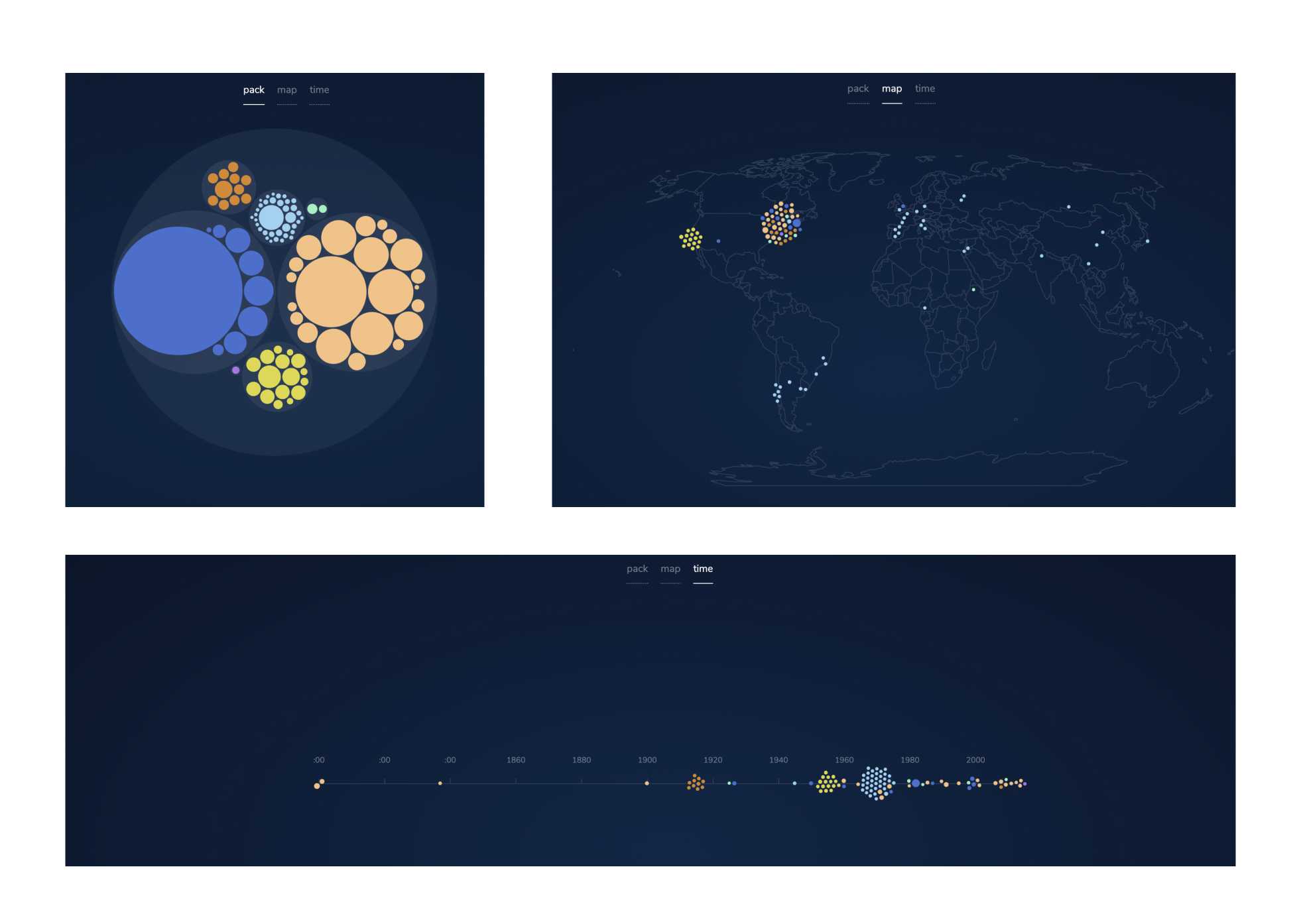
The general idea was to get the user to lean forward and explore the data, with the animations hopefully being a bit of a pull and the talkative pop-ups to add some depths.

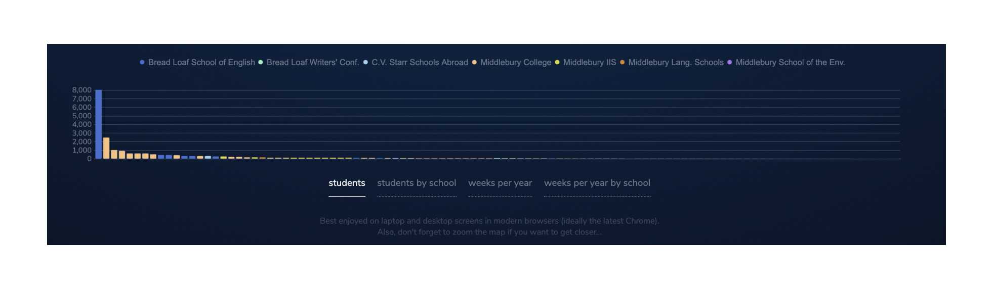
In addition a linked bar chart at the bottom adds some rank and order on the fly.
△