The Tree of Charts


On the one hand the tree of charts is a simple visual search engine for different chart types. It has 88 charts dangling of its branches and you can pick them by just searching or browsing the tree. On the other hand it focuses the thought-process when moving from raw data to a visual.
The motivation
Often it's great to play around with data and different visuals in your tool of choice, but apart from being a time-saver having a pond of already tested and chewed over visual forms in place allows us to test more, fail quicker and find salvation sooner. Once we have followed some guidelines and understand the connection between data and their forms better, it's easier and clearly more enjoyable to break the rules where necessary. Once we know the traditional forms it'll be simpler (and certainly better) to engage with individual visual primitives rather than set charts - as manifested in Leland Wilkinson's Grammar of Graphics and supported by free-ranging visual tools like ggplot2, processing, D3 etc.
The applied framework orders the chart-finding-process along 3 lines:
- What data have we got?
- Why are we producing a visual?
- How are we designing it?
In fact, the tree has a lot more flexibility and doesn't force anyone to think along this straight line, but these 3 questions are recurring in the descriptions and the tree structure (= soft education).
Standing on the shoulders of Tamara Munzner
The framework (partly surely amateur-like) applied has been developped by Tamara Munzner in her 2014 book Visualization Analysis and Design and leads the interested person through above pipeline of questions to arrive at the right visual idiom (in her case often large-scale visualization systems - in this case relatively standard charts). The above 3 steps are only a brief summary not encapsulating the more elaborate process she describes but for my small brain and this chart- rather than system-focussed project - they suffice.
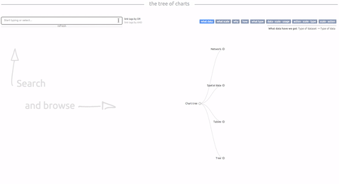
How to use
Search
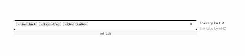
Have some data and a vague idea of what you want to show. Search for:
-
Chart name
-
Data type (Munzner categories)
- Tables
- Spatial data
- Network
- Tree
-
Data type (Schneiderman categories)
- 1D/Linear
- 2D/Planar
- 3D/Volumetric
- nD/Multidimensional
- Tree/Hierarchical
- Network
- Temporal
-
Number of variables in your (long/narrow) dataset
- 1 variable
- 2 variables
- 3 variables
- 4 or more variables
-
Number of categories (maximum number of categories if you have a categorical key variable)
- under 10 categories
- 10-99 categories
- 100-999 categories
- 1000 and more categories
-
Number of values (maximum number of datapoints the visual can/should display)
- under 20 values
- Dozens of values
- Hundreds of values
- Thousands of values
- Infinite no. of values
Chart cards
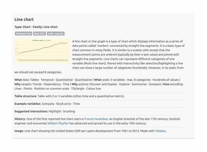
The chart cards show an image, a quick description to the chart and under more info you'll find keywords to Munzner's process, a description of a (potential) table structure, some example variables and historical background where available.
I did not try to re-invent wheels. Although most of the texts are written by myself and a good chunk of visuals are also hand-crafted in D3js, Tableau, Excel and R, a good piece of the material is taken from sources who have already described or produced the charts in a better way than I could. It's a medley...
The tree
You can either browse the tree freely or click browse tree on the found chart cards to find your visual in the tree. Once in there you can browse the tree and see what other charts might tickle your pickle.
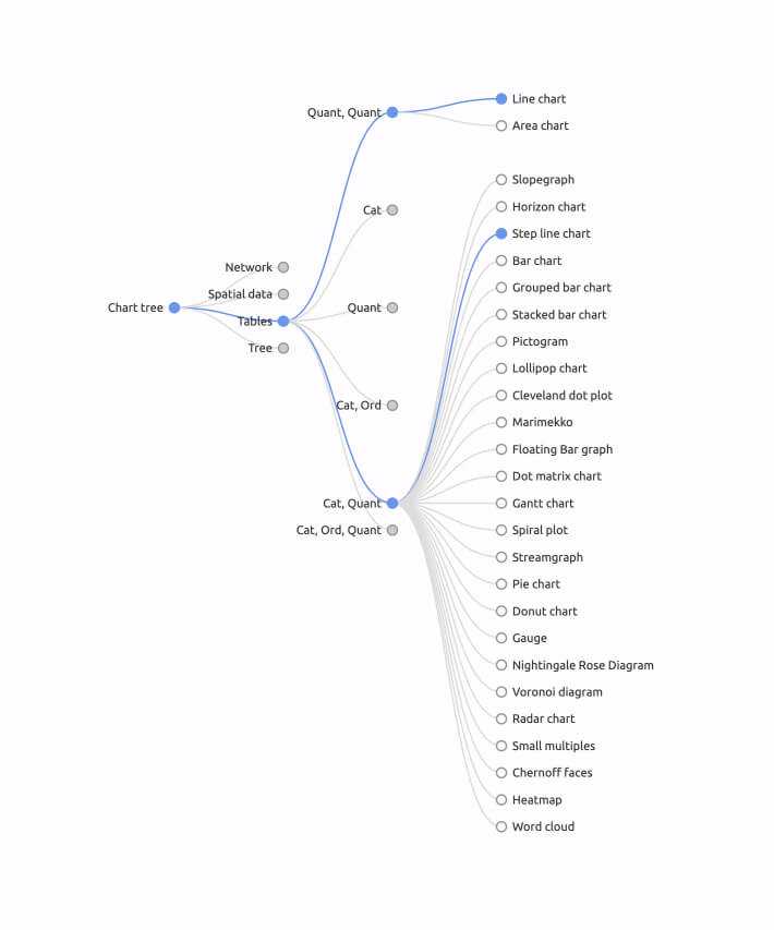
The tree is also shape-shifting. It can change hierarchy depending on what conceptual journey you opt for to find your chart. You can for example start thinking about the type of dataset you have (table? network? etc.) and then what type your data is (quantitative, ordinal, categorical). To do so, hit what data (a short description of the hierarchy is shown underneath the buttons):

Or you might come from less techincal and more conceptual ground thinking about why you want to build a chart (what is your main interest? what is the aim of the visual analysis?). There's a tree for that via the why button.
Best to play with really...
Credit
As said, conceptual credit mainly goes to Tamara Munzner, as well as numerous other sources considering taxonomies from various angles.
Here's a short list of papers considering the topic from a number of angles:
- The Eyes Have It: A Task by Data Type Taxonomy for Information Visualizations - a taxonomy by data types, by Ben Shneiderman's
- A Taxonomy of Visualization Techniques using the Data State Reference Model - a taxonomoy of data transformations by Ed H. Chi
- Watch This: A Taxonomy for Dynamic Data Visualization by Joseph A. Cottam et al.
- A taxonomy of temporal data visualization techniques by Chaouki Daassi et al.
- Taxonomy of Visualization Techniques and Systems – Concerns between Users and Developers are Different by Qin Chengzhi et al.
- Rethinking Visualization: A High-Level Taxonomy - a taxonomy based on algorithms by Melanie Tory and Torsten Möller.
Similar online projects also allow a fantastic overview. Above all there is the Datavisualization catalogue by Severino Ribecca as well as all sources from this great gitHub repository by Marielle Lange.
Coding credit to Mike Bostock for D3, jjzieve and select2.
Information credit stretches to many people and sources whose books, blogs, talks and seminars I read and visited. Edward Tufte, Jeffrey Heer, Mike Bostock, Vadim Ogievetsky, Nathan Yau, Kaiser Fung, Stephen Few for numerous examples and critiques.
Image credit belongs to a great number of sources, I have attributed wherever I could. Please let me know, if you find your image here and want to have it removed or replaced. The picture use in this context seems unproblematic due to the images' fair use for research and educational purposes, however, please raise your hand if you feel any images are used inappropriately.