Visual Poetics
Character


This series humbly looks up to Aristotle asking him how his principles of storytelling can be applied to, and potentially enhance, data visualisation. So far, I’ve collected initial thoughts, and introduced some deliberations to one of his key principles: Plot. This post will look at another most crucial principle: character – before collecting the rest.
Character is the second most important principle in Aristotle’s considerations. Aristotle’s characters have a rather pre-determined trajectory from prosperous to abandoned; the classic tragic course. The fortunes need to collapse from good to bad, brought about by a character weakness or — and this is preferred — by a lack of knowledge. Both seeds of doom are ones we’re all acquainted with and can relate to. This character’s flight path, Aristotle suggests, is the safest recipe to tie in the audience’s pity and fear of the same fate. The character's main task is to tie in the audience’s emotions through empathy. He or she falls from fame to shame. And so do we. We identify with a strong character to begin with and learn our lesson on the way alongside the protagonist. Empathy, our capacity to step into the protagonist’s shoes, ropes us in. The more empathy we allow for the character, the more likely we will be to learn from the play.
Now then. This character classification is too specific to apply to data visualisation as such. Data is not human; it’s abstract. We can’t put ourselves into the emotional reference frame of a datapoint. We can indeed create emotional ties to data representing human emotions; Periscopic's Gun Deaths establishes an emotional link with a curated animation about lost years due to gun crime in the US. But by no means can this be a universal principle to be applied in data visualisation.
What we can and should establish is engagement. Not so much as a function of empathy but as a function of good design. Aristotle’s protagonist, who successfully ropes in the audience, is good design. The character is designed for human understanding, that we can take her perspective. Sometimes visualisation presents character, often it presents abstract concepts. But our final goal remains the production of knowledge and meaning and we can only achieve that by users following the visualisation.
Having said that, it appears that one of the key problems we face in data visualisation – more so than in other communication media — is medium specific literacy on the reader’s part. Data visualisation literacy is part data literacy (= number sense) part visual literacy (= visual perception, experience and accuracy). In order to get to our final goal of knowledge-meaning production we need to win the reader’s commitment to (1) look at the visual (2) learn to read the visual (3) interpret the numbers and finally (4) learn or understand something from the numbers. That’s often a big ask – sometimes even for a simple bar chart. In order to help understanding we want to make our visualisations easily accessible, comparable and relatable; or to put it differently we want to use visual design, allegorical design and topical design...
While a single visualisation won’t be able to instil statistical foundations, we can use visual design to communicate data with as little perceptive burden as necessary, allegorical design to activate existing mind models as well as character design to enable human connections.
Visual Design
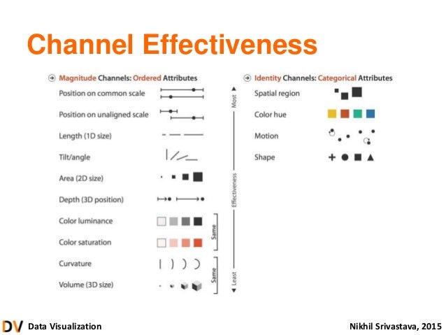
We achieve a proficient visual design by rules of channels effectiveness (see here or here and the gestalt laws). This way we allow an easy connection between concept and reader.
Allegorical Design
Allegorical design tries to liken our dataset visually to already known concepts in nature or elsewhere. It is about producing natural reflections in our visuals. This can be as simple as using natural colour schemes or encoding information in organic design that the human eye reacts kindly to as it compares with the known natural.
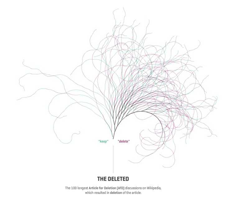 Notabilia by Moritz Stefaner
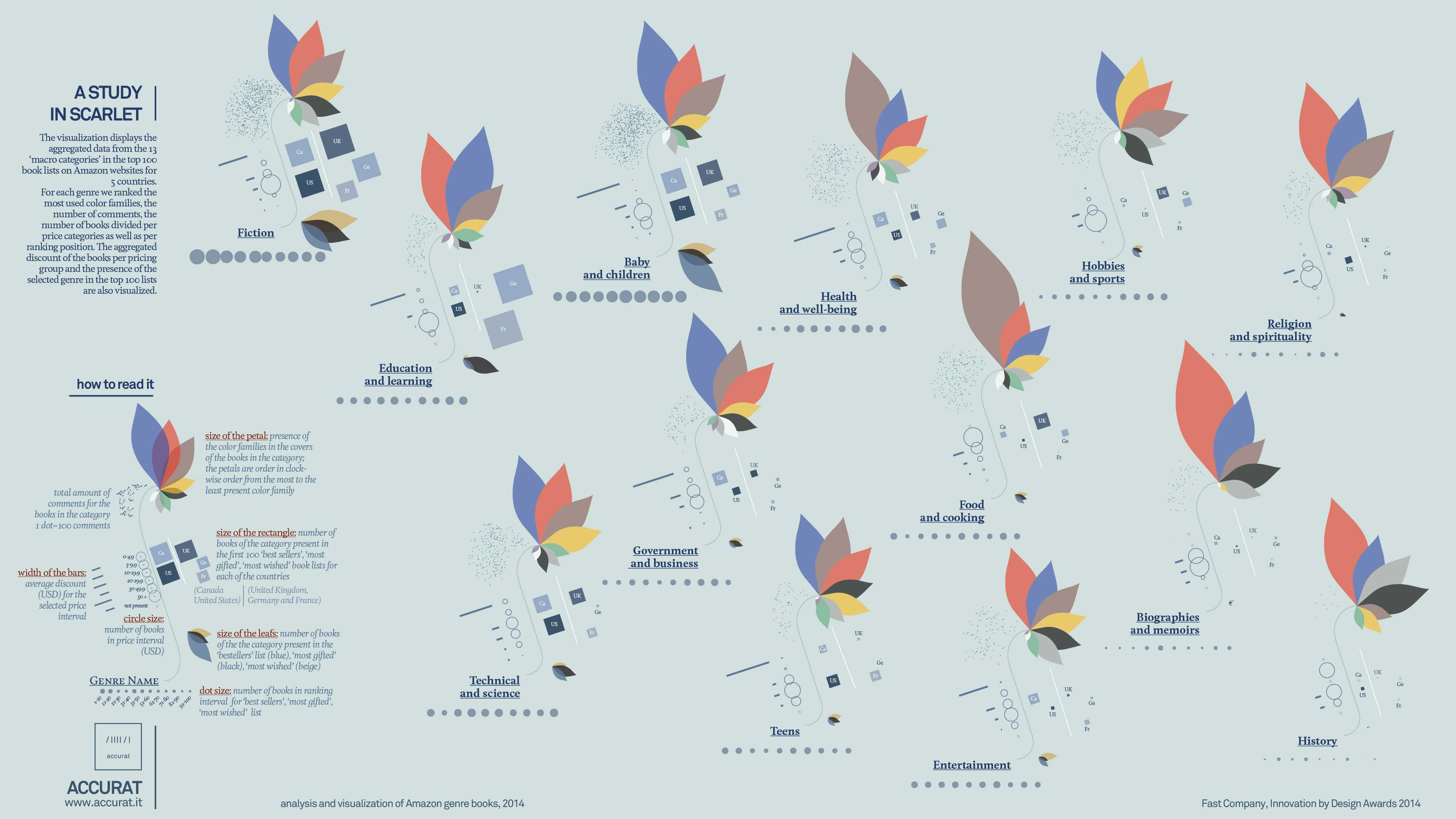 A Study in Scarlet by Giorgia Lupi/Accurat
 (En)tangled Word Bank by Stefanie Posavec
Character Design
Finally — and this can’t always be the case — we can attempt to apply an effective character or topical design by means of spending time and space to characterise people or forces that are part of the visualisation. Going back to the NY Times oil price visual, the US and OPEC are set up as two players on the field. No empathy in the literal sense, but my involvement in the piece is raised by the focus on two forces who propel events with actions. When producing our visuals around characters or character-like units, the readers will negotiate their very personal position to both, the US and the OPEC against the backdrop of nationality, personal view about shale oil and politics of the involved parties/countries/characters.
Another often helpful path to engagement is telling the story of the data exploration. Where did the data come from? How difficult was the cleaning process? What did I expect — what surprised me? Any schoolboy-errors on the way? And how did I finally got to the results? The best documentaries often have very strong narrators.
Overall it helps to keep this role of character in mind and probe for the opportunity to sketch out characters — even non-human characters — to introduce engagement.
The goal of all 3 design concepts — visual, allegorical and character design — is to achieve increased engagement that clears the high hurdle of reading and memorising the data. Engagement buys patience to learn the visual, which promotes understanding and potentially a changed perspective.
With plot and character in the bag, the next task is to look at all the remaining concepts... Moving quickly now !